Blog

Introducing Purple Sonic The Hedgehog

This is a bit off topic, but my five year old daughter asked me to teach her to draw Sonic the Hedgehog today, so I walked her through it by drawing him myself as she followed along step by step. The results of that exercise are below:

img_20180906_175134

As you can see, she opted to make her sonic a giant balloon. Not content stopping with that bit of artistic license, she decided she wanted to make a “Purple Sonic”, which came out with a decidedly Picasso-like feel:

mvimg_20180906_200632

You’re forgiven if you initially though he was facing the left (he is not). As a tribute to my daughter’s creation, I’ve created a videogame version of Purple Sonic to be played exclusively in Microsoft Excel, free to play for anyone here. I’ve attached it below for your gaming pleasure.

Enjoy.

Purple Sonic

Say This, Not That: “Solar Produces More Jobs Than Oil and Gas” Edition

Do you ever hear someone that you agree with use a terrible argument in a debate and shudder? Their position is the same as yours, but they’ve just used a questionable or downright misleading premise to back it up, weakening your position by association and opening you up to straw-man attacks. Now you’re locked into a debate within a debate, and nobody seems happy.

I’ve been there, on both sides. I’ve repeated some talking point I picked up without checking it first only to get called out, then furiously do 15 seconds of research on my phone that only confirms I’m wrong, then end up ashamed that I blindly accepted an argument just because it seemed to perfectly line up with the point I was trying to make. Why couldn’t I have just used a better argument?

I guess fake news is catchy on a Facebook feed, but that’s not the only culprit here. Real news, or “technically accurate” arguments presented in a way that is clearly misleading to people who are familiar with the area can be even worse. So I’ve decided I’m going try to call out some of these bad arguments and offer better substitutes in a series I’ll call “Say this, not that,” inspired by the popular healthy eating guide (Although more often than not I still choose “this” over “that” when it comes to their suggestions).

Today’s topic is a jobs-related talking point in favor of solar energy that has come up recently following President Trump’s recent decision to put a 30% import tax on solar panels among other things. I have discussed this topic before (these assertions are mostly based on energy job analysis that is a year old), but the headlines I keep hearing repeated seem to be particularly egregious now and increasingly cited without regard for the full content of the underlying articles or the broader energy picture.

Not content to merely indicate that the U.S. solar industry has created a lot of jobs (supporting a substantial 260,777 workers that spend greater than half their time on solar projects and an additional 113,730 jobs where people spend some portion of their time on solar projects), what I now hear is that Solar represents “more jobs than oil, gas, and coal combined.” This argument is not new and was already true last year, if limited to jobs relating to electrical power generation, as noted in this Forbes article. Other outlets such as like IFLS, ran with a headline reading “Solar Employs More People Than Oil, Coal, And Gas Combined In The US”. Other offenders were the Natural Resources Defense Council (U.S. Clean Energy Jobs Surpass Fossil Fuel Employment), The Independent (US solar power employs more people than oil, coal and gas combined, report shows).

Don’t get me wrong, that solar is employing such a large percentage of the electric power generation workforce is impressive, even if these jobs aren’t creating the most energy per job (that’s a different topic that I beat to death earlier and you can read about here). However, the number of solar jobs overall aren’t even close to the number of jobs that oil and gas creates because most oil and gas does not go into electric power generation. This is because, electric power generation only represents a relatively small slice of the US energy picture.

A few sources[i] peg the United States’ total electrical energy consumption from all sources at around 4,000,000,000,000 kilowatt hours (abbreviated kW-hr) per year. That’s the number four followed by 12 zeroes, and for reference a 60 watt light bulb would theoretically consume 1 kW-hr about once every 17 hours. Even converted to barrels of oil equivalent, this is an impressive 2,400,000,000 barrels per year, or about 6.5 million barrels per day. However, it is still important to note that despite creating a large number of jobs, for the 12 month period ending October 2017, Solar power in the US has had only produced 51,800,000,000 kW-hr, or a little over 1% of annual electric consumption in the US. Here’s a graph that show’s how production numbers break down[ii].

US_Electricity_by_type (1)

If my math is right, Solar’s production is the rough equivalent of 83,500 barrels of oil per day. For comparison, the U.S. consumes close to 20 million barrels of actual oil per day (about a fifth of the total world consumption) and is expected to produce over half that amount. In addition, the US consumes about 27.5 trillion standard cubic feet of natural gas, about 13 million barrels of oil equivalent per day, and is projected to produce even more gas than it consumes.

As for how absurd the lack of the qualifier “electric power” caveat skews the jobs argument: For US jobs overall, Oil supports 502,678 jobs, only 12,840 of which are associated with electric power generation. Natural Gas supports 392,869 jobs, only 88,242 of which are associated with electric power generation. If you want to see all the numbers yourself, they’re actually presented in a really clear fashion in the Department of Energy’s U.S. Energy and Employment Report published in January 2017 (link), which I would note is the same report on which all of the aforementioned articled were based.

This is where I should probably mention that article headlines are engineered to be clickbait, and in most media aren’t even written by the author of the story, but instead by people marketing the story in a way that attracts the most viewers.

So for this round of debate on the 30% tariff on cheap solar panels from China, please don’t tell me Solar generates more jobs than Oil and Gas, that is wrong. Don’t even tell me Solar generates more jobs within the electric power generation sector, which while technically correct sounds weak and opens the Solar industry to (unfair) attacks of lagging efficiency on a per job-basis. Instead, mention that the Solar industry already employs hundreds of thousands of Americans and is still growing incredibly quickly. Mention that solar power emits no CO2. Mention that Solar could provide a way to eliminate many of the environmental and safety risks associated with hydrocarbon exploration and production; Curtailing the need for energy firms to explore production of sources areas that are controlled by hostile governments, or that are environmentally sensitive, or contain oil that is costly or dangerous to produce.

Most importantly, acknowledge that there are no silver bullets to the world’s energy issues, and listen to the people you are arguing with, even if they seem like your ideological opposite. They probably have some good points and ideas too, and in my experience people are much more likely to consider your evidence if you hear them out first.


[i] http://bfy.tw/GETM Yeah, I’m feeling that lazy with the endnote references today.

[ii] By Wikideas1 -https://www.eia.gov/totalenergy/data/annual/showtext.php?t=ptb0802ahttps://www.eia.gov/electricity/monthly/, CC0, https://commons.wikimedia.org/w/index.php?curid=64602758


What Drives The Price of Oil?

This is a topic that has been written about a million times already and many of you reading this will know most of the things I am about to write. However, for my friends who don’t follow the industry or never took a macroeconomics class, this is something I find interesting and therefore believe you will as well. I hereby declare a hearty “You’re Welcome” for publishing this article that none of you asked for[i].

Here’s the short version: Oil costs money to extract from a reservoir, and the amount of money it costs to produce varies wildly based on the oil reservoir location, physical properties, and method of extraction among other variables. Some of the world’s oil can be produced profitably at $20, but a lot more can be produced profitably at $100. The price point at which oil production shifts from a money loser to money maker is referred to as the “breakeven” price.

“Breakeven” price is often used to describe specific oil fields or types or even companies themselves. If more oil is produced than is used, usually due to higher production or reduced demand, oil inventories start to grow and the price of oil drops until inventory levels stabilize again. If oil prices are low enough, this stabilization can occur because oil producers simply shut off production from sources that have higher breakeven prices than the current price of oil. For example, a well with a breakeven point of $45/barrel may be produced when the price of oil is $50, but shut down when the price falls to $40 to avoid losing money. If enough wells are shut off that inventories return to normal levels, prices should stabilize around the new point.

Although how quickly production is shut down depends on how easily is it to stop and restart production and short term price projection, this drop in price will cause some of the oil production with the highest breakeven price to stop. This in theory rebalances supply and demand, stops the growing inventory, and stabilizes the price of oil. Well, in theory.

Alright, so that is the basics. Let’s look at some of the variables[ii] at play here. To keep things somewhat manageable, fort his post I’ll limit my scope to looking at oil cartels, increased production from fracking companies, inventory, and trading Impacts on oil price.

Price Fixing and Oil Cartels

Because of historic uncertainty around oil price due in large part to periodic flooding of the oil market with new production that caused price collapses, oil cartels such as the Texas Railroad Commission or the Organization of the Petroleum Exporting Countries (OPEC) have spent most of the last century trying to stabilize (or maximize, depending on who you ask) the price of oil by restricting member production to balance supply with demand. The word “cartel” generally has a negative connotation in the US because price fixing is a decidedly un-capitalistic behavior for private players. The activities of the Texas Railroad Commission on private producers were constrained to only prevent physical waste associated with improper extraction of oil and not allowed to impose production to prevent “economic waste” associated with price crashes[iii]. This role has fallen to OPEC for the last 60 years.

It would be an understatement to say that OPEC was not very popular with most people I knew in college in the mid-2000’s when oil prices soared and it began costing over $20[iv] to fill up gas tanks like the one in my 1992 Chrysler New Yorker.  However, since oil is traded on the world market, OPEC’s imposition of production restrictions have provided assistance US suppliers by allowing them to produce at a much less restrained rate by preventing them from bearing the burden of price collapses that would have occurred had all oil producers continued seeking to maximizing their own output.

Of course, the US has long been a net-importer of oil and thus the maximized profits of these US companies has come largely from the hands of US consumers, but the profit has at least been disproportionately transferred to US producers over OPEC members as US producers. US producers have been rapidly eating away at OPEC’s access to the US market with the explosion of production that has occurred in the last few years. This is why OPEC decided not to cut production in 2014, to protect their market share against the rapidly growing US producers that would have benefitted from these cuts. By many accounts, this tactic to allow the price to crater to drive US production out of the market has not succeeded as well as OPEC had hoped, and they have since reversed course with a series of cuts that should continue through 2018.

Frackers Won’t Die

OPEC’s move was transparent, and while many small companies may have driven out of business by the move, many are kept afloat by their investors and continue to plug along posting loss after loss because a rebound in oil price would quickly erase those losses and them some. It also doesn’t hurt that there is a lot of extra capital in the world that people are desperate to put anywhere, inflating the value of stocks, housing, Snapchat, and whatever else might continue to rise in value[v].

The broader, non-oil market may or may not be about to crash, but the potential downside does seem to be growing relative to the upside. The same thing can’t necessarily be said about many smaller oil stocks, which can be had at a tiny fraction of what they cost a few years ago. A sudden swing in oil inventories, unrest in a major oil producing nation, or any number of factors could send the oil price back to 60 or 70 dollars, which would probably be enough to double or triple the value of some of these firms, especially ones that have found ways to more efficiently make production targets and chip away at their breakeven price. They could go to 0 as well, but that’s part of the fun I suppose.

As long as this extra production stays online, OPEC will have trouble balancing oil supply without continued output cuts. Additionally, as these companies get more efficient in how they produce oil and continue to grow their production and reduce their breakeven price, they could end up setting, and gradually lowering, a price ceiling in the oil market. The theory is that if there is a large chunk of production with similar per barrel production cost, the price will have trouble overshooting this production breakeven cost for long periods of time, if their supply ends up representing the key barrels of oil that causes global inventory increase rather than decrease or stay flat.

By the way, this is probably a good time to point out that I am right now (On January 19th, 2018) continuing a half-finished post, which based on the timestamp was last saved on June 8th, 2017. Since then, prices have turned around dramatically and as of this moment, WTI (US Marker Crude) is sitting at $63.45 per barrel while Brent (UK Marker Crude) is at $68.68 per barrel. As for my prediction with regards to price, most larger oil producing and refining companies have done very well in the last 7 months, but so has the overall market. Smaller companies that have taken on a lot of debt have not really double or tripled in stock price, although the value of their production has certainly increased. I suppose the market did a good job of pricing in the eventual turnaround in price, but the jury is still out for a lot of companies on how well the higher prices will allow them to emerge from their piles of debt. This seems like the part where I disclose that I own a small stake of Chesapeake Energy Corporation (CHK), which hasn’t yet seen its price rebound along with oil and seems to be constantly zipping along a knife’s edge when it comes to solvency (you can do it, buddy!).


Inventory Management

Oil inventories is a word you hear a lot when hearing industry financial news. They serve as a buffer to differences between supply and demand, and because of this the quantity and rate of change in oil inventory becomes one of the key drivers of oil price as mentioned earlier. When more oil is used than produced, there is a drawdown on oil inventories to make up the difference, while inventories increase when excess oil is produced. However, because inventory represents actual physical oil in a location, different places can have different inventories and different ways of tracking it. Some have said that OPEC governments intentionally shifted inventory away from the US and to other countries because the US inventory is more rigorously tracked, while oil could hide in other markets. Additionally, there is quite a bit of floating inventory in the world, tankers loaded with oil wandering about while prices are low, although improving markets started to reverse this trend in late 2017. Of course, even poorly tracked inventory can’t hide forever, but any increase in oil price until it returns is free money in the seller’s pocket. Current world energy consumption is nearly 100 million barrels of oil per day[vi], which means that every day the price is increased by a dollar represents an additional $100 million dollars in profit every day. Stretch that one extra dollar out for a whole year and you can split and extra 36.5 billion dollars between the world’s oil producers.


Trading

Regardless of what is happening, the price of oil is going to be set by those buying and selling it. In 2007 when I was graduating college and oil prices were surging, oil speculators were a common bogeyman for people alleging price inflation. Although traditional economics would suggest that an efficient world market would consider all of off the important, publicly-known factors and dictate a price perfectly in line with those, weird things happen in the oil market and you end up with situations where oil reaches impossible to maintain highs (>$150/bbl in 2008) and lows (<$30/bbl in early 2016).

Before I talk about traders, I should mention something that makes the oil market harder than other. An Important factor driving swings in prices is the relative inelasticity of the demand curve for oil. That last sentence was full of pretentious business words, but think of it this way: Say you love Cracklin’ Oat Bran, which costs $3.89 per box at Target right now[vii]. Would you still buy that cereal if the price tripled to $12? OK, there’s not a great replacement cereal for Cracklin’ Oat Bran, so maybe you would, but overall sales would probably plummet immediately. However, if your car ran on Cracklin’ Oat Bran and you needed it to get to work, you probably wouldn’t run out and buy a car that used less Cracklin’ Oat Bran, or a new house that required you to fill up your Cracklin’ Oat Bran tank less often[viii].

To be honest, when gas prices skyrocket last, I didn’t even go out and check the air pressure in my tires, which was the go-to ‘helpful’ recommendation everyone tried to give for decreasing oil consumption. Sorry, saving 0.6% of my gasoline bill on average is not worth my time regardless of what the price is, try harder. Speaking of that…

Don’t even get me started on this nonsense.

So back to traders. Many oil traders are companies trying to hedge their bets to avoid a financial shock due to shifting oil prices. Though they can make quite a bit when prices shift suddenly, they can just as easily find themselves on the wrong side of that same trade. This means that while speculation can exacerbate prices, it’s not as if the traders are the ones reaping the reward at your expense. Instead, a lot of that money is traded between the people doing the trading, and the people that make the good (or lucky) trades end up making money from the people doing the bad trades, allowing you to rest comfortably with the knowledge that most of the money you spend at the gas station is still going to the good folks that get oil from the ground and into your car and not traders pushing money around. Or if you don’t work for a major oil company like me and you don’t really care why the price is dumb sometimes, at least you clearly have a lot of free time to get to the end of a long article like this one.

There’s a lot more I could write on oil prices, but this has already become a lot longer than I intended, and I should probably just post this before I get sidetracked for another 7 months and the market changes in a way that invalidates everything I said. Thanks for reading, let me know what you think in the comments.


[i] I assume if you clicked on this article you and I at least share some of the same interests, and there is scientific evidence that if you and I share the same preferences then you may also find this interesting. From the American Psychological Association 2010, Vol. 46, No. 2 Article entitled Children Reason About Shared Preferences, Christine A. Fawcett and Lori Markson from UC Berkeley explain:

In sum, the present study shows that by the third year of life, children are capable of recognizing another’s preference, determining whether that preference matches their own, and using this knowledge to make inferences about that person’s behavior to guide their own decisions.

https://pages.wustl.edu/files/pages/imce/children/fawcettmarkson_2010.pdf

Therefore, anyone who clicks this article and thinks that I am being presumptuous to assume you would find this interesting is either a liar or lacks the developmental maturity of most 2-year-olds.

[ii] I love using the word “variables,” it makes any analysis sound scientific and gives it the veneer of mathematical rigor, even when it’s dumb business garbage where people are basically trying to guess how much money a bunch of guys in New York can create out of thin air. As you can see, my grasp on basic business concepts is incredibly strong.

[iii] For more information on the Texas Railroad Commission’s efforts to restrict oil production to prevent economic and physical waste (as well as the entire history of oil) I would suggest reading Daniel Yergin’s The Prize. However, for those of you that don’t have time for an 800 page biography of oil there’s a very short version of the mission of the TRC here: https://www.tsl.texas.gov/exhibits/railroad/oil/page6.html

[iv] I began driving myself to high school after I turned 16, and my parents would reimburse me for one tank of gas a week. To maximize the amount I could drive I would let the tank get as close to dry as possible. I remember wishing I had printed a receipt the week my fill up cost $23 and my Dad seemed certain I was lying. Also, I’m guessing I had gleefully skipped into the house and informed him of this cost like a smug entitled jerk, which at 32 I now realize was probably the bigger issue.

[v] After spiking and crashing during the beginning of the great recession, S&P 500 price to earnings ratios have risen steadily for the past several years, gradually inflating the value of the companies in the index relative to the actual earnings those companies report (see http://www.multpl.com/table). People have used P/E ratio to say the market is overvalued for at least the last two years, but the money keeps flowing into the market. Although I say this is relation to almost everything, someone must know something I don’t.

[vi] U.S. Energy Information Administration (EIA) short-term outlook from January 9th, 2018: https://www.eia.gov/outlooks/steo/report/global_oil.php

[vii] Dang, I’ve actually paid $5.50 for a box of that cereal before, but mostly because I was bringing it to a buddy in Brazil who couldn’t find it there. $3.89 makes me want to go pick some up, but I digress.

[viii] I like not bringing the analogy back to oil directly, because the work Cracklin’ Oat Bran is pretty fun to read and write. Cracklin’ Oat Bran.

“Simple” Level Control on an FPSO

One of the great things about the school I went to, The[i] University of Tulsa, is that the Chemical Engineering department was full of people with pretty extensive industry experience, and they solicited feedback from different employers on what coursework might add the most value for new graduates. During my Junior year, one of the things that came out of this feedback was that graduates with a better understanding of process control, which in general terms just means automated methods of controlling things like temperatures, pressure, flowrates, levels, or other variables in a system. In laymen’s terms, you know how you can never turn the red and blue knob or the fan speed setting in your car to make the temperature just the way you like it? They taught us how to be really awesome at stuff like that[ii].

On top of a dedicated process control course, the program began adding some additional process control elements to our unit operations lab class and elsewhere. I found the detailed material in this work, which included Matlab control simulations, control tuning methods, and even the use of Laplace transforms, fascinating. However, as is the case with most problems I have faced in the real world, most process control solutions employ almost none of the really interesting stuff you learn in college outside of the functions of a basic PID controller, which are explained pretty well on Wikipedia for those of you interested. You won’t need none of that to follow along with this story though, which covers one of the simplest and most costly control issues I have battled: How operating a facility on top of a rocking boat can absolutely wreck your ability to provide stable level control.

Full disclosure, this will be a less detailed version of an internal presentation I was selected to perform at my Chevron’s annual Facilities Engineering Virtual conference, so any of my colleagues interested in more technical details should tune into that sometime in October.

For those of you tuning out because you think process control is complicated or boring, wait for me to at least explain why the former isn’t true. The example I’ll [iii]discuss today will deal with basic level control in what is typically referred to as a knock-out (or KO) vessel, named this way because it “knocks out” any liquids entrained in the vapor phase before sending vapor downstream. Controlling the level in KO vessels is generally easy as they typically only get small amounts of liquid that just need to be periodically drained off, but are designed to be large enough to handle huge monstrous slugs of liquid that don’t happen that often. Imagine you have half a glass of water that is being refilled extremely slowly, and you want to maintain it at that 50% level regardless of how much is or isn’t being poured into the glass. If you have a straw, you might suck harder as water is poured in more quickly, or more slowly if just a trickle of water is being poured in. Or, if the flow is slow enough, you might just suck a little bit out every time the water reaches some level to keep the glass from overfilling. That’s a stupid example, but it gives you an idea of the type of dumb stuff engineers can get paid barrels of money to fix[iv].

Of course, we don’t suck fluid out of our process vessels with straws, we have drain pipes equipped with valves that open and close to allow fluid to flow out more or less quickly to maintain level. When the level falls below the desired amount, we close the valve and allow liquid level to build up. When the level goes high, we open the valve to bring it back down. We typically use the aforementioned PID controller to “tune” the response of this valve so it doesn’t open or close too quickly or slowly. To make this even easier, one of our “glasses” might be 12 feet high and four feet wide, and we can usually allow our levels readings to fluctuate quite a bit one way or another before there is a significant issue, so you wouldn’t think this is rocket science.

Part of the problem is that we almost never work with the entire glass. The range of “fullness” that is typically measure between 0 and 100% is limited to a small section of the vessel that has a level bridle attached. This is because you are severely restricted in how high or low you can really allow the level to go.

On the low side, you generally don’t want the level to fall so low that the vessel is sucked dry, which could allow any high pressure gas in the vessel to shoot out the drain line and overwhelm downstream equipment. There is often a significant safety margin applied so that this level does not fall below 30-40% of the measured level range. If it does, a safety valve on the outlet will typically close, refusing to allow any more liquid to escape.

On the high side, you have a different margin applied, usually one that doesn’t allow the level of the vessel to reach the point where fluid is filling the vessel, which is often already on the bottom half of the vessel. This is because the stream of incoming liquid and vapor needs a significant amount of height to allow liquid to separate from the vapor. If the liquid level of the vapor exceeds this inlet level, the incoming flow can blast this liquid upwards through the top of the vessel, not unlike what would happen in our example glass of water if instrad of sucking you decided to blow into the straw as hard as you could. Not only does this defeat the purpose of the “Knock-out” vessel, this gas is often going to sensitive equipment that is not equipped to handle liquids. If the knock out drum is upstream of a burner that isn’t designed to handle liquids, you may at best end up damaging equipment or at worst cause a rain shower of potentially burning liquid hydrocarbon to come raining out of a facility flare. Here’s what it looks like when a refinery flare meant to burn gas is sent liquid crude:

Why, yes, that is flaming oil falling to the ground. Not exactly an ideal situation.

Knock out drums are also typically upstream of compressors, which are machines that generate pressure to move fluid by compressing gases (as their name would indicate). The problem with sending liquids to a compressor in that liquids are not compressible, and can result in severe damage to compressors. Compressor are not only costly equipment to repair, but the loss of an important compression system can bottleneck or even shut down an entire plant for an extended period of time if there are not adequate spare compressors to maintain operation.

So suddenly our half-full glass starts to look half empty, as we realize our level bridle only measured about a sixth of the vessel height, and 50% really means half the distance between a third and halfway up the vessel. Our 12 feet of height has become 2 feet, and if we intend to keep our levels between 30 and 70% of that range to provide margin, that 2 feet becomes a range of 0.8 feet from high to low.

And now we get to the rolling.

I currently work aboard a Floating, Storage, Production, and Offloading Vessel, often referred to as an FPSO. When people ask me where I work, I say it’s a boat, because that’s what it looks like. In fact, the FPSO I work on is a converted oil tanker that had all of its main oil-production related equipment added on decades after the ship was built. One end of our ship, the turret, is fixed, allowing production lines to come into the ship without twisting and snapping. The rest of the ship swivels 360 degrees around the turret. I honestly don’t know enough to adequately explain the setup in words, but here’s an excellent animation that kind of gives an idea of how it works:

Neat-o! I still have no idea exactly how it works.

One problem with working on the ship like this is that when bad weather hits, or the wind and waves push perpendicular to each other, or the boat has just offloaded a million barrels of oil and has a high center of gravity, these factors can cause the vessel to roll pretty significantly. As some of you may have seen on my Facebook, I have measured the total combined roll of the FPSO on which I work as between 15-20 degrees total, meaning the ship can roll up to 10 degrees a single direction. The motion is slow enough (about 10-12 seconds per full roll) that it hasn’t made me seasick[v], but it can make sleeping nearly impossible at times, and persistent rolling throughout the course of a day does seem to make myself and others drowsy.

Using the tangent of 10 degrees as a guide (0.176), I can see that the level at the edge of this hypothetical vessel (diameter=4 feet, radius=2 feet), can increase or decrease by about 0.35 feet. However, the level bridle measuring the fluid level can be a foot outside of the vessel. If this is aligned in the same direction of the roll, the deviation in our theoretical vessel can be up to 0.53 feet each direction, or 1.06 feet total. In this case, even if we kept our vessel at exactly “50%” of the desired range when the vessel was stable, the indicated vessel level would fluctuate between 23.5 and 76.5%, easily enough to sound a high or low level alarm every 5 or 6 seconds as the vessel rolls.

Go back to that example of the glass of water with the straw and imagine that glass slowly being rocked a few degrees to each side. You would be able to see the water level was only rising on one side and falling an equal amount on the other and would be unlikely to completely lose your mind due to this, but individual level bridles only have the ability to see one side of our glass, and it drives them nuts. The automated controller will keep opening the drain valve and letting little blurps of fluid drain out every time the level exceeds the desired setpoint, until the level settles at a low enough level that the desired setpoint becomes the high level on this peak. This means the level alternates between “good” at the high point and “unacceptably low” on the other end, which means the low safety level usually gets violated and causes the backup safety valve on the drain to close, blocking in flow and allowing fluid to enter the vessel without draining until this safety valve is reset and re-opened, or the vessel reaches a high level and shuts down the plant before we get to that whole “rain of fire[vi]” scenario mentioned earlier.

As shown above, the level controller on the right has opened the control valve to the point where the “high” side of the level is right at the desired setpoint. However, the backup shutdown valve is generally tied to a separate, redundant level safety transmitter bridle in order to preserve multiple independent layers of protection against high and low level scenarios. Although it doesn’t really matter which side I drew this bridle on since the level will fluctuate on both sides, I have shown how the level safety transmitter currently reading “too low” on the “low” side, causing the shutdown valve to close. This is not a control valve, and once it closes it will remain closed until the low condition has been cleared, often requiring an additional manual input from the control room before being allowed to re-open.

Imagine being in a control room on a ship, already groggy and perhaps queasy from trying to focus intently on managing the plant while your entire world has been rocking for hours, and all the while potentially dozens of these alarms keep coming in every few seconds. Even worse, imagine knowing that each one of these level alarms means the system is on the verge of shutting itself down due to high or low level, resulting in potentially millions in lost revenue. Here’s another thought: Imagine programming the automatic PID controller, using these levels to automate the opening and closing of the drain valve on the vessel. Without any other information, the PID controller’s programming is to open the valve as is a flood of liquid is entering the vessel every few seconds. Good luck tuning this controller to maintain that average level at “exactly” 50%. The observed change in level during one 6 second period of roll can easily be as high as the change in level during “stable” operation of the vessel was allowed to fill up on its own for minutes or even hours depending on the service. The change in level doesn’t have to be the extreme case presented above either, a roll that results in level readings that fluctuate 10 or 20% are more than enough to ruin the function of a control loop not designed to handle them. In many cases this results in the automatic control being overridden altogether, forcing the control operator to make his best guess as to what the valve opening should be to maintain a relatively constant average level.

There are a few ways this can be addressed. A dampening factor can be added to each PID controller to reduce the effect of rolling, the valves of the level bridle can be partially closed as to mechanically “dampen” or reduce the rate at which the level bridle fills during periods of roll (I wouldn’t advocate for this), or the controller loop can use a time averaged value to eliminate control overreactions based on short periods of rolling. We chose to implement the third option, as this averaging could be put in one place and tracked through our distributed control system. It’s not a perfect solution, but averaging the last two or three values reported for level allowed the controller to take into account level readings at various points in the ships roll, and the high and low numbers typically canceled each other out. This enabled many of the controllers to remain engaged in automatic control mode, as their tuning parameters were able to be adjusted without having to worry as much about rolling behavior. I’d definitely recommend this approach to anyone else who sees their alarm panel go off like a Christmas lights every time their facility starts moving.

FPSO rolling is not a new phenomenon, and I’m sure I’m not breaking new ground, or…er, water. Anyone more familiar with the topic please let me know what you’ve seen in design or operation and let me know what I screwed up in the comments.

[i] Yes, the “T” is capitalized. I never really understood why.

[ii] Although taught only as an elective at The University of Tulsa, automobile A/C knob turning is actually a standalone major at most state schools in Oklahoma.

[iii] Remember what I said about being oversized? The vessel not only has to be tall enough to allow a big slug of liquid to come in, but it is also typically sized tall enough to have some non-trivial amount of residence time for liquid to flow into the vessel at that high rate. The vessels are also wide to allow gas to flow upwards slowly, making it less likely that high-velocity gasses will carry out any sizable droplets of water.

[iv] In defense of engineers, a buddy of mine who studied computer science at Tulsa made thousands of dollars on the side providing tech support, which from what I gather consisted almost entirely of going to people’s houses to unplug things and then plug them back in.

[v] Others on our ship haven’t been so lucky. And by others I mostly mean David.

[vi] Not to be confused with Reign of Fire. Obligatory shoutout to Deepak Chetty who shaved his head to look like Matthew McConaughey in that movie. Deepak’s Hard Reset is now available on Steam. I know that nobody ever clicks any of the links I put here because WordPress likes to remind me of this, but I encourage you to check this one out: http://store.steampowered.com/app/669970/Hard_Reset/

What is *Really* the Cheapest Source of Energy?

DSC05271 (2)

Spoilers: It’s not elephant power.

A friend of mine in college recently posted the following open question:

There has been a lot of brouhaha recently about “there are X times the number of jobs in ‘green energy’ than in coal.” Relating to the number of jobs, can someone tell me how many megawatts/gigawatts are produced on a per capita basis in each of these energy “sectors?”

My initial though was that this was really a loaded question, a fallacious argument that ‘green energy’ wasn’t as efficient because the cost to build out new capacity (often referred to as Capital Expenditure, or CAPEX) far exceeded the operating expenditures (OPEX) required to maintain power generation from existing plants. Of course coal plants are less labor and cost intensive, they already exist! I also knew from my previous research on this subject that overall costs of solar plants were approaching parity with traditional coal plants. My initial instinct was to pour cold water on the whole argument[i].

However, before I hit send, I thought about the question a bit more. I recalled what I knew about oil refiners in the US, and how building new capacity usually costs much more than simply buying or expanding existing facilities, and thus no new refineries have been built in decades. Maybe my friend was right, and reports of cost parity of green energy sources relied too heavily on a fallacy of their own, mistaking the alternative not as new coal plants, but rather maintenance and expansion of existing units.

I left a comment saying this might be something that would be interesting to look into. I assume Facebook’s algorithm took note of my reply because it then put a comment made by another of my friends five days earlier on the top of my feed:

It’s amazing to me that the solar industry flaunts its terrible productivity as a selling point. “We produce the least terawatt-hours using the most workers!” That’s not a benefit!

That comment was issued with a link to a Fast Company article trumpeting that in the US, solar energy now provides twice as many jobs as coal.

I do agree with both of my friends that claiming certain investments create jobs is dubious, and I would rather focus on the cost of each alternative in dollar terms to make sure these investments are economically sustainable or at least approaching sustainability to make sure any jobs they create do not suddenly vanish once political winds change or subsidies expire. For that reason, understanding how close green energy is to competing to legacy energy sources economically is the exercise I took on here. Note that when I say energy in the scope of this post, I am referring to electric power generation and not discussing fuels directly used for personal transport.

The Data

The first data point I wanted to explore was something that was said in the aforementioned Fast Company article, which stated:

While 40 coal plants were retired in the U.S. in 2016, and no new coal plants were built, the solar industry broke records for new installations, with 14,000 megawatts of new installed power.

If my hypothesis was that existing coal capacity would be more competitive than newly-built capacity, the fact that 40 existing coal plants were shut down with no new ones built would seem to indicate that this is not true. However, following the oil refinery model where refineries have been closing for decades without replacements being built, this could also just mean the lost capacity was being offset by increases in production in other units. Following the article’s source for the statement led me back to the US Energy Information Administration (EIA), a reputable government source which I have used multiple times for other pieces on this blog. The EIA provides tons of data as well as projections, both of which can be used to infer how different technologies will compete for utilization now and in the future.

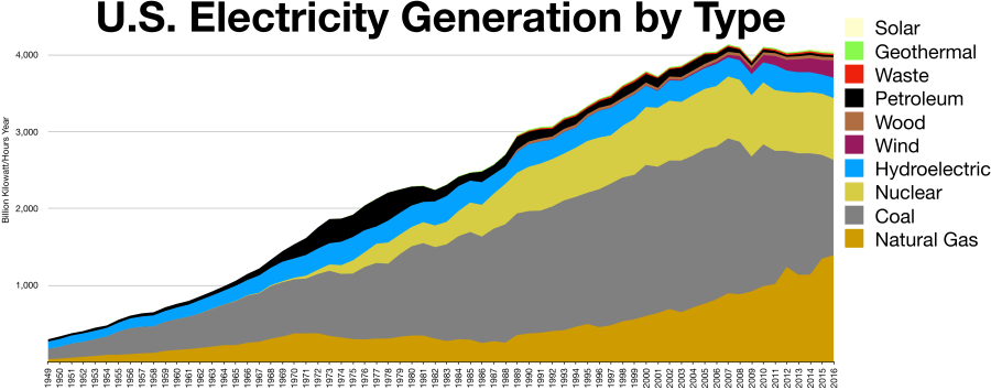
The EIA provides monthly spreadsheets tracking almost all US power generators with some exceptions, and each one appears to contain details for all individual US power generation plants with capacities over 1 MW[ii] as well as planned plant retirement times. There are 20,870 plants listed in the “operating” tab of the nearly 7 megabyte Excel spreadsheet that in all have 1,183,011 MW of total listed nameplate capacity.[iii]

By filtering the data for the most recent spreadsheet from March 2017, I can see that plants representing 26,614 MW of capacity have planned retirement dates between March 2017 and December 2021. Only 215.5 MW of this retired capacity represents ‘green energy’, and of this 215.5, 207.6 is the result of the planned retirement of some of the capacity of the Wanapum hydroelectric plant in Washington State, which has been in operation since 1963, although a quick Google search makes it appear that this capacity is actually going to be replaced and expanded. In terms of capacity, most of the retirements affect coal (12,163 MW), Natural Gas (9,320 MW), and Petroleum Liquids (778 MW) facilities.

While the total capacity being retired between now and the end of 2021 is very low in terms of total capacity, replacing this with renewable resources would account for over two-thirds of the EIA’s current projected green energy growth between 2017 (207,200 MW) and 2021 (244,630 MW)[iv]. The “Planned” plant tab of the EIA generator spreadsheet backs this up, with the 113,698 MW of planned capacity to be started up between now and 2027 much more heavily tilted towards green (or at least “Carbon-free”) energy sources than the existing energy mix. These plants include wind (22,570 MW, 19.9%), solar (9949 MW, 8.8%), nuclear (5,000 MW, 4.4%), as well as hydroelectric and geothermal combining for an additional 997 MW (0.9%).

This is good and bad news for the future of green energy. On one hand, it would appear to support my position that there is significant growth available for renewables to compete with other sources where new infrastructure is required. The downside of this is that following the EIA projections through 2050 only gives a total green energy capacity of 433,490 MW, well under 5% of the total electrical generation asset mix.

The Alternative

You might have noticed that the “Carbon-free” energy sources only represent about a third of the total planned capacity to be added. But there are no coal mines replacing the ones being shut down. Instead, almost two-thirds of the planned new plants utilize Natural Gas (72,659 MW, 63.9%).

If green energy has a real threat going forward, natural gas is a…uh, erm…natural choice[v]. In terms of price per unit energy, Natural gas has cost only a fraction of what oil does, even when oil prices crashed[vi]. The current price of Natural Gas is approximately $3/million BTU, and a barrel of oil contains about 5.8 million BTU, making the cost of Natural gas approximately $17.4 per barrel of oil equivalent (BOE).

From an environmental perspective, Natural gas is cleaner than coal and produces about half the amount of CO2 per unit energy produced. This is primarily because Natural gas has a higher heating value per unit weight of fuel than coal (Coal heating value is generally between 7,000 and 14,000 BTU/lb, while Natural gas is up to 21,500 BTU/lb). In fact, the US’s aggressive shifting to Natural gas-based electricity generation was cited by many as a reason the Paris climate accord was unfair to the US, as we had already reduced our Carbon emissions quite a bit because of technological advances that allowed the US to replace chunks of coal power with Natural gas:

As I indicated in my comments yesterday, and the president emphasized in his speech, this — this administration and the country as a whole — we have taken significant steps to reduce our CO2 footprint to levels of the pre-1990s.

What you won’t hear — how did we achieve that? Largely because of technology, hydraulic fracturing and horizontal drilling, that has allowed a conversion to and natural gas and the generation of electricity. You won’t hear that from the environmental left. –EPA Head Scott Pruitt, June 2nd, 2017

I don’t want to wander back into climate change again (although that is and will continue to be a recurring theme here), but I do bring this up because when judging renewable energy on its cost merits, I believe too much emphasis has been placed on coal and not enough on Natural gas.

And the Winner Is?

So, if you think the EIA has been pretty informative about this whole topic, you’re right. In fact, they basically have the answer to the cost question already spelled out, but that wouldn’t have made for a great discussion. Here’s what EIA says the CAPEX and OPEX numbers say for Natural gas compared to the most cost-effective wind and solar options (for those of you that did not bother to click the link above to see the raw data, EIA did note that these are unsubsidized costs based in 2016 dollars). The CAPEX and OPEX numbers are what I pulled from EIA, while the hypothetical CAPX and OPEX were calculated in Excel based on a theoretical 100 MW plant.

First up, conventional fired combined cycle Natural gas:

Natural Gas (Fired Combined Cycle)  Conventional  Advanced Natural Gas (Advanced with Carbon Capture and Sequestration)
CAPEX ($/kW) 969 1013 2153
OPEX (Fixed, $/kW-yr) 10.93 9.94 33.21
OPEX (Variable, $/MW-hr) 3.48 1.99 7.08
Hypothetical CAPEX, 100 MW Plant $96,900,000 $101,300,000 $215,300,000
Hypothetical Annual OPEX, 100 MW Plant $4,141,480 $2,737,240 $9,523,080

Fired Natural Gas Turbine (this is what we use on the FPSO where I work)[vii]:

Natural Gas (Fired Combustion Turbine) Conventional Advanced
CAPEX ($/kW) 1092 672
OPEX (Fixed, $/kW-yr) 17.39 6.76
OPEX (Variable, $/MW-hr) 3.48 10.63
Hypothetical CAPEX, 100 MW Plant  $109,200,000  $67,200,000
Hypothetical Annual OPEX, 100 MW Plant  $4,787,480  $9,987,880

Finally, Wind and Solar:

Wind, Solar Solar (Photovoltaic) Wind (Onshore)
CAPEX ($/kW) 2277 1686
OPEX (Fixed, $/kW-yr) 21.66 46.71
OPEX (Variable, $/MW-hr) 0 0
Hypothetical CAPEX, 100 MW Plant $227,700,000 $168,600,000
Hypothetical Annual OPEX, 100 MW Plant $2,166,000 $4,671,000

Based on the EIA numbers, the cheapest option by far is advanced or conventional Natural gas plants. However, if you include carbon capture and sequestration (CCS) costs, wind and solar would seem to come out on top (although solar only marginally so on the strength of its much lower OPEX in that scenario).

There is a significant cost differential created by the need for CCS that shifts the equation. However, given that even using Natural gas without CCS does significantly cut overall CO2 emissions when replacing coal facilities, there is still some environmental driver to employ that technology even without CCS, as a “stepping stone” to environmentally friendlier power generation.

For those looking for a talking point against Natural gas, from a long-term environmental viewpoint, the amount that cheap Natural gas will stall efforts to install permanent green energy solutions could stall and by some estimations could eventually leave us in a worse position than we are currently. Also, cutting our carbon footprint in half is great, but if a country like India increased their per capita electricity usage to even a quarter of the US using Natural gas than the net impact would be an increase in CO2 emissions[viii]. It may seem ironic that our great achievement in cutting CO2 emissions through the installation of Natural gas fired generation facilities would result in absolutely massive overall increases if replicated throughout the world, but that is a natural consequence of living in a fully developed country with energy demands an order of magnitude higher than that of the developing world.

In any event, EIA projects based on our current path that even the application both of these technologies will not result in a dramatic shift CO2 emissions by 2050, with or without adherence to the Obama Administration’s Clean Power Plan (CPP). The US per-capita carbon footprint will fall from its current 16.3 metric tons/year to either 12.7 (22.1% reduction) with CPP or 14.0 (14.1% reduction) without it.

I won’t be researching the projected external costs and consequences of climate change in this article, but I can state with confidence that investment in Carbon-neutral energy will have to accelerate at a much faster pace if we plan to effectively mitigate them. Of course, as is the case with emerging technologies, I’m not sure what green energy might look like in 5 or 10 years. I used to think that green energy was a great idea but an investment with costs an order of magnitude higher than conventional fuels. This isn’t the case, and if there are even a few marginal breakthroughs left to be found the field, the situation could easily be flipped on its head, with Carbon on the losing end. I don’t know how/if/or when this might happen, but I may take that on as a separate entry later.

How Does This Money Support Jobs?

Going back to the original question in this post, CAPEX money is generally a one-time cost for construction of a plant. As noted, this is very labor-intensive and why the solar and wind energy companies can boast about how many jobs they create compared to coal. Variable OPEX costs generally refer to fuel, which is why these are 0 for wind and solar. However, money paid for Natural gas will directly support jobs in the Natural gas industry. Fixed OPEX costs are more likely to include maintenance and repairs, which also require skilled labor.

For me, while I concur with my second friend that from an economic standpoint it’s generally better focus first on the per-capita value from the jobs you create than the quantity, I don’t necessarily agree that the idea that the only thing we get in this case is energy. Without an honest discussion about how to quantify the costs of externalities associated with CO2 emissions, we can’t really pass judgement.

Thanks for making it to the end. I didn’t make it easy this time, only one safari picture/sight gag (I may add some later if anyone has any ideas). As always, let me know what you think, especially if you think I screwed something up.

[ix]

[i] It’s amazing how often I, and everyone else, mistake gasoline for ‘cold water’ when trying to end an internet argument. I’ll talk about that more in another post.

[ii] Although the notes on the file claim “Capacity from facilities with a total generator nameplate capacity less than 1 MW are excluded from this report.  This exclusion may represent a signifciant portion of capacity for some technologies such as solar photovoltaic generation,” there are some plants with a capacity of <1 MW in the list. Also, the word “significant” is misspelled in the report and this seems a suitable forum to issue a public service reminder that Excel doesn’t spell check cell text by default.

[iii] As mentioned in a previous blog post, US electricity consumption is 3,913,000,000,000 kW-hr/year, which converts to 446,689 MW on a continuous basis. It seems important to note that plant nameplate capacity is generally the highest designed usage, generally whatever the highest anticipated peak usage for the facility, which will be much higher than the average use.

[iv] From a separate projection provided by the EIA. You can find theire energy projections here: https://www.eia.gov/analysis/projection-data.cfm#annualproj


[v] I can’t tell you how much I hate myself for this joke. Oddly, I can’t seem to make myself remove it.

[vi] US Natural gas has cost is currently about $3/Million BTU between 1 and 11 dollars per thousand cubic feet for decades (https://www.eia.gov/totalenergy/data/browser/?tbl=T09.10#/?f=M), and about 5800 cubic feet equal a barrel of oil equivalent (BOE). This puts the range of prices in BOE as approximately $5.80 to $63.80, well below the

[vii] EIA did not include estimated costs if Carbon Capture and Sequestration were to be applied to Gas Turbines. I’m not certain whether this is due to a lack of data or technical limitation that prevents CCS from being applied to gas turbines (I can’t think of one but if anyone knows this please let me know).

[viii] From the IEA (different than EIA), US per-capita electricity consumption is 13 MWh/capita compared to 0.8 for India. India also has 3 times the population of the US. Therefore if the US cuts the carbon footprint of electricity generation by a factor of two through the use of Natural gas, India could wipe out all of those gains by installing the exact same plants “more environmentally friendly” plants in order to lift their per capita energy consumption to 3 MWh/capita, less than a quarter of the US per capita demand. This is why I find it dishonest to claim that countries like India aren’t doing their fair share in multi-national climate accords that show their total emissions rising while countries like the US decrease.

[ix] I’ll get back to this in a later post. I’ve already written too much.

How Many Solar Panels Can You Make For the Cost of The Border Wall and Would They Even Fit?

This was originally something I looked at over the course of a few minutes and wanted to post on Twitter, but then realized there was no way I was going to make it fit. So here it is on the depository I created for the long-form version of my most boring-est thoughts.

A story broke earlier today that President Trump suggested adding solar panels to the border wall to help it pay for itself. In light of this and earlier accounting suggesting the price of the Border Wall as originally envisioned could be as high as US$66.9 billion, I was wondering how much electricity we could currently build in solar for that amount of money. As it turns out (assuming my math is correct), if we were talking about using that sum of money to build utility scale single axis tracking solar systems, we could  potentially build enough solar capacity to generate about 10% of the total electricity consumption of the US.

My 30 second Excel spreadsheet completed with a Wikipedia source is below.

Value Unit Source
1.49 $/Watt Solar Energy http://www.nrel.gov/docs/fy16osti/66532.pdf
66,900,000,000 Dollars (66.9 Billion) http://time.com/4745350/donald-trump-border-wall-cost-billions/
44,899,328,859 Total Watts 66.9 billion/$1.49 per Watt
393,318,120,805

(393 billion)

kWh/yr (Total Watts/1000)*365*24
3,913,000,000,000

(3,913 billion)

US Electricity Consumption (kWh/yr) https://en.wikipedia.org/wiki/List_of_countries_by_electricity_consumption
10.1% % of Total US Electricity Consumption

In fairness to myself, that Wikipedia article did do a good job of at least listing its source, the CIA World Factbook.

Now, would the wall provide sufficient surface area for all that wattage? Google tells me that solar panels generate 10-13 Watts per square foot. Based on my total wattage number above, 44899328859, this means we would need about 4489932885.9 square feet of area using the conservative 10 Watt/square foot number (see what I did there?). My favorite source also tells me that the US-Mexico border is 1954 miles (10117120 ft). That would make the border wall need to be over 400 feet wide to accommodate the proposed wattage at 10 watts per square foot.

DSC05386

This doesn’t really belong here, but here’s a picture I took of an ostrich to break up all the boring text.

Yeah, so none of this seems likely for a bunch of reasons. On top of the behemoth panel width, I’m guessing the proposed panels were probably fixed and not tracking, which brings down the efficiency, and the installation costs would be massive and likely in addition to the actual construction costs of the wall instead of displacing any of those costs. As for how you tie in 1954 miles of 400 foot wide solar panels into a distribution grid and how much you would lose in transmission losses tying all that in, I’m just going to say that’s outside my scope. Not even I like math that much.

Feel free to check my work and let me know what I messed up if you find anything.

P.S.-After posting, I realized the formatting of the Excel table is terrible. I’m not fixing it, I just wanted to make sure you knew that I knew that it is terrible, that’s all.


Ghost Ride The (Pencil) Whip

During my undergraduate study at The University of Tulsa, I was required to take Organic Chemistry and lab as part of the core Chemical Engineering requirements. Although I enjoyed the subject, the lab portion of the class was boring and tedious, and my work tended to be sloppy and rushed.

One thing we were forced to do periodically was find the melting point temperature of whatever solid substance we had precipitated out of solution that day. I remember this task distinctly because it was always the last thing we had to do before the lab was finished. The first time we had to do this I rushed the test, turning up my Bunsen burner as high as I could to get out of the lab and on to something more interesting. My boiling point was way lower than the number the literature suggested it should have been for the pure component, so I had to perform the test again to make sure there wasn’t some contaminant in my precipitate that lowered the result. What I discovered was that my mercury thermometer’s indication couldn’t quite keep up with the actual temperature of the material when heated so quickly, and there was still some lag in the reading even when I heated the precipitate at a “normal” rate.

Following this discovery, I began performing this test more slowly to make sure my numbers were correct… Just kidding, I started making my boiling points a little bit less than what the textbook said they should be and called it a day. I was a Freshman in college and had more interesting things to do than spend an extra 30 seconds watching Mercury rise. I guess the moral of that story, other than “Cory was a terrible O-Chem lab student”, is that if you tell someone to perform a test and all they need to document is a single, relatively predictable number, you can expect that number might be made up.

It seems strange now that my terrible lab work would teach me some of my best lessons. If I was to make up or massage lab numbers, I was going to give some good numbers, or at least believable ones. I figured out that different types of analysis have different biases, different ways they naturally skew data. I knew straightaway that I couldn’t make my numbers too perfect, but they also couldn’t be messed up in a way that the test method would have never done. In the real world, this knowledge is far more valuable than most of the things you officially ‘learn’ in lab, because as it turns out testing results get made up constantly.

Back in 2014 I was just starting my stint as an Offshore Process Engineer for an FPSO in Brazil. One of my first orders of business was chasing down strange results we were having with a field test that consistently produced different results from an onshore lab, and I decided to make my own standard to verify the device we were using was accurate.

The results of the field test were in parts per million (ppm), and the calibrated range of the device should have gone up to at least 100 ppm. However, when I tried to make my own 100 ppm standard the device read it as 350 ppm. I made two more 100 ppm standards and tested them across all of the available field testing devices, and got readings ranging from 340-380 ppm. I may not have been a great chemistry lab student but I’m pretty sure I can pipette a standard volume of fluid without being off by a several hundred percent. At least, I never had pipetting problems in the past, but now I wasn’t so sure that maybe I had skipped the class where they explained how pipettes will secretly suck up some random quantity of liquid unless you know the magic word[i].

OK, enough pipette talk. Creating a standard wasn’t the first troubleshooting method attempted, as a colleague of mine who was convinced the issue was with the onshore lab had left on my desk four signed and dated calibration certificates from a licensed third party contractor that showed that all four devices I had tested were nearly perfect. Each certificate showed how the device read the standards created by the contractor, who presumably hadn’t been absent from the aforementioned pipette awareness day in college:

Prepared Standard (ppm) Device 1 Reading Device 2 Reading Device 3 Reading Device 4 Reading
0 0 0 0 0.1
10 9.7 10.2 10 10.4
50 49.4 50.3 50.5 50.7
100 99.6 100 101 99.9


Drawing upon my experience as a terrible lab student, I immediately knew something was wrong, or we had gotten some sort of magical chemistry wizard out to prepare the most accurate standards I had ever seen. I refused to believe this guy prepared a bunch of standards so precisely that he got each of the devices to read within about 1% of where they should be while I seemed to be hitting everything but the lottery with my results. When I wrote to the vendor support site, even the president of the company that manufactured the equipment found the need to chime in and note that they could not reproduce these types of numbers that the contractor had provided in their own lab. The certificates were almost certainly BS.

But just to be certain…I had our certified third party calibration expert come back out and watched over his shoulder as he got the devices all calibrated and reading correctly, this time within a +/- 15% range. As suspected, all of the previously calibrated devices were off by a factor of about 3.5, and my ability to work a pipette was validated. I distinctly remember being more upset that the guy wasn’t competent enough to make up reasonable numbers than I was that he didn’t actually do any work. The latter I had already become accustomed to expecting in Brazil, the former would take me another few months to get used to as I had more run-ins with what they call the Jeitinho Brasileiro.

A few months later I ran into an issue with results coming from the same device. To be fair, the problem I had wasn’t that the device itself was giving bad readings as it was the people responsible for collecting data seemed to disappear for long periods of time without performing any tests. I decided since I had thousands of data points from them, I might as well see if I could do some sort of randomization analysis of their results to see if anything was amiss[ii].

Randomization analysis is tricky. It’s not often that you can say you have data that should be truly random. Even cherry-picking a random decimal point in a dataset might not work if the results cluster or there are too few significant digits in the data. For example, imagine a test reporting out to the tenths digit numbers that typically fell around 1.9 to 2.3, but never fell below 1.8. This would cause the results to bunch around the minimum, over-representing numbers close to it. Even the tenths digit would be a poor choice of a random number, as this would be skewed towards the digits that appeared in the most common results, 1.9, 2.0, 2.1, 2.2, etc., while I would also expect a relative dearth of threes, fours, fives, sixes, and sevens if the result rarely rose much past 2. However, if you were to examine a test where the results were spread between 15 and 100 (increasing your number of significant digits to 3 in the process), those tenths-digit numbers might start to look very random.

Fortunately, these happened to be the type of results I recently had to review. They ranged from the mid-teens to over a hundred, with no clear low-end asymptote to skew that last tenths digit one way or another. Perhaps if some of the operators performing the test rounded off results to the nearest whole number I would expect to see an excess of zeroes, but other than that I couldn’t think of a reason that tenths digit wouldn’t appear to be random. Most importantly, I had been diligently recording all of these results into an Excel spreadsheet every day for over a year, and everyone knows that you can’t have more than a hundred numbers in any given spreadsheet without some sort of dubious statistical analysis being performed on it[iii].

I took all of the results and deleted all of the times where no reading was taken (as these blanks would register as 0.0 and throw off the analysis), then used the MOD function of excel to get the remainder left over when you divided the results by 1. Multiplying this by 10 gave me a neat set of whole numbers between 0 and 9. I used the Excel data analysis add-in to run a histogram on these numbers and found that out of 7358 readings the tenths digit was only zero 531 times. Using the binomial distribution function of excel I calculated the odds that a random sample of 7358 numbers between 0 and 9 would only have 531 or fewer 0’s. The odds of that happening naturally in a set without any inherent bias are, to put it lightly, low.

This is the part where I want to caution that the fact that an outcome is unlikely does not necessarily mean foul play was involved. For instance, you would only have a 12.5% chance of winning a coinflip three times in a row, but I wouldn’t automatically call you a liar or a cheat if this happened. However, the odds of the results containing this few “0’s” is the same as winning that coinflip 56 times in a row. As they like to say at the coinflip table in Vegas; “Fool me 55 times, shame on you, fool me 56 times, shame on me.” To make matters worse, if any real results were rounded to the nearest whole number, the actual number of legitimate zeroes would be even less. Also, it just so happens that when human beings try to create random numbers, they generally select 0 a lot less frequently than other numbers[iv].

Digit Frequency
0 531
1 843
2 873
3 661
4 818
5 705
6 658
7 795
8 750
9 724
Total 7358


So there are approximately 200 zeroes missing-plus or minus maybe 30, as there is about an 8% chance you would get fewer than 700 zeroes, back within the realm of possibility. On average, you’d have to make up 10 readings without a zero for a zero to go missing, and you would have to make up 2000 readings for 200 zeroes to go missing. And that assumes that you never make up readings with round numbers. If they make up random readings that are whole numbers 5% of the time instead of never, then that means that about 4000 of the readings are fabricated, as it would take 20 bad readings to get rid of a zero.  And of course, if any of those guys ever round off their numbers, boosting the number of zeroes artificially, the situation could be even worse than this indicates.

For me, the moral here is that if the number looks strange, investigate the number first. This doesn’t just apply to numbers supplied by humans either, transmitters slide from their calibration or break for other reasons all the time[v]. I have found data scrambled in so many ways that it would be impossible to remember them all. However, what I do know is that it’s much easier to troubleshoot why a number is wrong than to scour your process in vain searching for explanations for garbage data.

[i] Skittles

[ii] This is apparently not everybody’s first response to a problem like this. In fact, my former rotating alternate had this to say about my analysis: “Wow, you really went full Beautiful Mind on that.  I am surprised that I did not go into our cabin to find a bunch of newspaper articles cut out with pins and red string connecting them.  Or photos of people with the eyes cut out.  I think that was a different movie.

[iii] Cough, six sigma, cough.

[iv] I know I read this somewhere, but I can’t remember where I got this from. It makes sense to me though, I can certainly imagine I would instinctively put a non-zero number at the end of my bogus data if my goal was to create random looking numbers, or at least numbers that didn’t seem made up.

[v] Seems odd to leave a footnote a sentence before the end of the article, but seems wrong to leave out one of my favorite bad data troubleshooting stories entirely. Two machines testing a refined product specification in a refinery had never disagreed until one day, they did…repeatedly. Nobody could figure out why, but they could pinpoint that the machines started disagreeing after they changed the specification in question from -40 degrees to -50 or so. Eventually somebody found out that the first machine was configured to read Celsius, while the second one read Fahrenheit. I guess that just goes to show that there’s nothing like the Jet A cloud point specification to bring together the English and SI systems of measurement.

Does The Methane Recapture Rule Make Sense?

I don’t intend to make every blog post here in my about climate change, but it’s such an interesting subject that sends so many numbers flying around that’s it’s hard for a math, science, and energy nerd like me to ignore. With that in mind, here’s something I came up with on the Methane Recapture Rule that might be wrong or right. Feel free to let me know how you think I did.

Back on May 10th, John McCain made news when he unexpectedly joined two moderate Republicans and 48 Democrats to maintain a last minute Obama administration rule on Methane recapture. While some have speculated that the vote may have been driven by spite over Donald Trump’s handling of the firing of former FBI Director James Comey, McCain himself had this to say about why he voted the way he did:

Improving the control of methane emissions is an important public health and air quality issue, which is why some states are moving forward with their own regulations requiring greater investment in recapture technology. I join the call for strong action to reduce pollution from venting, flaring and leaks associated with oil and gas production operations on public and Indian land.[i]

In terms of what this rule expected to accomplish, per a 2016 statement released by the EPA[ii], “The final standards for new and modified sources are expected to reduce 510,000 short tons of methane in 2025, the equivalent of reducing 11 million metric tons of carbon dioxide. Natural gas that is recovered as a result of the rule can be used on site or sold. EPA estimates the final rule will yield climate benefits of $690 million in 2025, which will outweigh estimated costs of $530 million in 2025.” For those of you playing along in the numbers game at home, a short ton is 2000 pounds, while a metric ton is 1000 kilograms, or approximately 2204.62 pounds. I’m not exactly sure why the EPA felt the need to mix their units between English and SI, but whatever, we can deal with that in an endnote later.

Methane and CO2 are both greenhouse gases. Although the effects of Methane aren’t as long lasting as CO2, it is generally considered about 20 times as effective of a greenhouse gas in the short term. That’s probably how the EPA figures cutting 510,000 short tons of Methane releases is roughly the equivalent of cutting 11 million metric tons of CO2 releases, unit goofiness notwithstanding. Assuming all this Methane was simply burned and released as COwould mean the savings were closer to 1.27 metric tons worth of CO2 releases.[iii]

My question is do these numbers make sense in the first place. The EPA release says the 510,000 short tons represent a 40-45% reduction of Methane releases based on 2012 levels, which would indicate that the US released somewhere around 1.2 million short tons of Methane that year. My first thought is to convert short tons to a number I care about, Standard Cubic Feet (SCF). To do this, we can multiply the number of lb-mols of Methane (63.75 million per footnote iii) by one of my favorite oil-industry conversion numbers that everyone should know: 379.5 SCF/lb-mol. This gives a seemingly crazy 24.2 Billion SCF of Methane releases in 2012. That number seems a little less crazy when you see that the US produced 25.3 Trillion SCF of gas in 2012[iv], in fact, a leak rate of <0.1% seems almost admirable. Of course, this also seems like a shamelessly SWAG’ed result which simply assumes a leak rate of 0.1%, especially since quantifying actual Methane leak rates is a notoriously difficult proposition – Almost as difficult as it would be to come up with the data to support the assertion 40-45% of those leaks can be recovered at a cost of 530 million dollars.

So how about those cost figures? If you assume that both the $530 million cost and $690 million benefit values are correct, then the rule has a healthy environmental profit margin of 30%. Of course, if I understand correctly, the O&G industry is footing the bill, so the only real case to be made is that this rule makes more sense than simply applying a $530 million dollar tax and deploying the proceeds towards carbon capture and sequestration (CCS) efforts.

Let’s start with the value driver, that $690 million dollars in 2025. Divide that number by the aforementioned 11 million metric tons of CO2 and you get a cost of about $63 per metric ton of CO2. If this is really the cheapest cost of CCS foreseen in the year 2025, then perhaps the rule makes sense economically. However, cut this cost down to $48/metric ton or less and your value driver vanishes, and you would be just as well off spending the 530 million on the cheapest available CCS technology.

Trying to Google the actual cost of CCS appears to be a difficult exercise, one that I don’t wish upon other people. Different applications of the technology in different scenarios will give many different results. The best resource I could find appears to be the IPCC Special Report on Carbon dioxide Capture and Storage, but it would suggest that for $48/metric ton you might find better value in applying CCS to new power plants. In addition to the IPCC work, a recently published Wall Street Journal article on peak oil demand showed that many oil companies are building in a cost of $30-$40/metric ton of COinto their future business plans, well below both the breakeven point of $48 that makes the rule profitable.

As for that $530 million number on the other side of the equation…I’m not even going to try to understand where that came from. I would be more inclined to believe the actual costs of compliance with the new regulation to be more than advertised, not less, but that’s just me editorializing on how I view the salesmanship of this particular rule. If you take the cost as stated, the math doesn’t seem to quite line up.

There’s obviously a bit of politics in play here as well (duh). It’s easier to pass a regulation advertised as low hanging fruit in the fight against climate change than to pass an actual Carbon (or in this case, Methane) Tax. The proof here is that the former was actually possible and done, while the latter appears to have very little chance at coming to fruition in the current political climate. With this in mind, an effort to do “something”, even if it does not make the most sense, trumps the desire to do the most correct thing. Also, not to be a downer, but while this number seems large, the actual carbon-offset potential of this regulation is equal to cutting Natural gas burning by less than 1% of the 2012 US gas production rate (40-45% of 20 times 0.1% of the US’s domestic gas production in in 2012). On a global scale, half a billion dollars, regardless of how it is deployed, doesn’t do a whole lot in terms of CCS.

[i] https://www.mccain.senate.gov/public/index.cfm/2017/5/statement-by-senator-john-mccain-on-blm-methane-recapture-rule

[ii] https://www.epa.gov/newsreleases/epa-releases-first-ever-standards-cut-methane-emissions-oil-and-gas-sector

[iii] 510,000 short tons equals 10.2 billion pounds of Methane, or 63.75 million lb-mols of Methane (molecule weight=16). Given that every lb-mol of Methane would stoichiometrically create 1 lb-mol of CO2, burning this amount of Methane would create about 28.05 billion pounds of CO2 (molecular weight=44), which converts to 1.27 million metric tons.

[iv] https://www.eia.gov/dnav/ng/hist/n9050us2M.htm


How Big is the Atmosphere, and How Much CO2 Do We Really Put into It?

Although the focus of climate change debates has shifted to the ability of climate models to accurately predict the impacts of CO2 in the atmosphere, surprisingly few people really have a firm handle on the much simpler question posed above. People love to debate and back themselves up with all sorts of information provided to them from other sources, but few actually want to put in any effort to make the transition from “knowledgeable” to “knowing” on any part of the subject. To be honest, this included myself, as I had always accepted that climate scientists had a pretty good handle and that a simple question lie this doesn’t need my analysis. Then I realized that as a chemical engineer who works in the oil and gas industry, this was a problem that I could find a solution to with a combination of Excel and Google in about two minutes. Although this also shows that this question really doesn’t need me to look into it, I needed something to do and Math can be quite a soothing activity.

random photo.JPG

This two year old photo of me pretending to turn a valve doesn’t actually have anything to do with this post, but there is a lot of math coming up so I figured I should put in a picture to liven it up. Photo credit to David Parham.

As with any scientific problem, the standard way to solve a question like this is to disprove that the opposite (usually referred to as the “null hypothesis”) could realistically happen. In our case the null hypothesis is that humans do not emit enough CO2 to significantly alter the makeup of the Earth’s atmosphere. Given that the increase in CO2 content of the atmosphere has been pretty widely documented as increasing at a rate of around 1 part per million per year since 1950[i], this should be a pretty straightforward exercise. No p value hacking or significance bands creation will be required for this one.

Having spent the last decade in the oil business, I know that the worldwide consumption of oil is about 90 million barrels per day, which translates to about 3.8 billion gallons per day, or 1.4 trillion gallons per year. To conservatively estimate the amount of CO2 this amount translates to, I will use an intentionally low estimate for the density of this oil (A lower estimate for density will give a conservative lower estimate for Carbon content). My assumption will be that this is all light crude with an API of 40, which is oil industry jargon for saying that its specific gravity is 0.825, which means each gallon will weigh about 6.9 pounds[ii]. I will also purposely assume that the carbon content of this oil is very low, using the same 75% carbon content as pure Methane (typically referred to as natural gas). In reality, both numbers will be higher, but in order to disprove our null hypothesis the best path forward is typically to make only assumptions that are clearly favorable would help the null hypothesis. This way, when the null hypothesis is disproved, there is very little wiggle room for it to fight back.

From chemistry, we know that every gram of Carbon (molecular weight 12) will yield about 3.66 grams of Carbon Dioxide (molecular weight 44). This is due to the weight of the two additional oxygen atoms added to the Carbon atom each weighing 33% more than the Carbon atom itself. Putting all this information together, I gather that from oil alone, about 26,100,000,000,000  pounds (2.61 x 10^13 pounds) of CO2 are released each year. This does not account for the fact that oil only represents between a quarter and third of the entire worldwide energy picture, and that the two other most significant chunks, coal and natural gas, would likely add a similar amount of emissions to the total.

Now while that amount of CO2 sounds huge, so is the atmosphere. One way you can tell the atmosphere is so huge is that it exerts a pressure at sea level that amounts to about 14.7 pounds of force for every square inch of the earth, because a 1 square inch rectangular prism stretching from the sea level all the way to the edge of Earth’s atmosphere will contain approximately 14.7 pounds of air. You can use this same trick to show that every 2.31 feet of water depth adds 1 psi (lb/square inch) to the water pressure. 1 square inch is 1/144 square feet. Multiply this by 2.31 feet and the density of water (62.4 lb/cubic foot) and you get one pound. This is why atmospheric pressure gives us a great way to simply calculate the weight of the atmosphere. If we can calculate the surface area of the earth in square inches, we can multiply this atmospheric pressure of 14.7 pounds per square inch to estimate the weight of the atmosphere. I should note that when I say this is a “great” way to calculate Earth’s atmosphere, what I’m really saying is that it is easy. In engineering easiness is tantamount to greatness.

Google tells me that the Earth has a diameter of 7915.5 miles. Assuming Earth to be a smooth sphere, the surface area would be equal to 4 times Pi times the square of the Earth’s radius (Area = 4 x Pi x R2). Of course, we will need to cut the diameter in half to get the radius, then multiply the radius in miles by 63,360 to convert it to inches (there are 5280 feet in a mile, and 12 inches in a foot, the product of which is 63,360). All of this math tells us the surface area of the Earth is about 7.9 x 10¹⁷ square inches, meaning the weight of the atmosphere is 14.7 times this number, or 1.16 x 10¹⁹ pounds. Dividing our earlier CO2 amount generated by this number and multiplying by a million would give us the amount of increase in annual atmospheric CO2 concentration that could be caused if all of the oil we burned simply stayed in the atmosphere as CO2. This ends up being 2.2 parts per million (ppm) per year on a weight basis, or 1.5 ppm per year on a volume basis. Gas concentrations are generally reported on a volume basis, and since CO2 is heavier than air (Molecular Weight of 44 compared to 29 for air), we’ll use the smaller number.

So there you have it, our conservative estimate says that our burning of oil on its own could theoretically increase the CO2 concentration in the atmosphere by 1.5 ppm per year, and since oil only represents a fraction of the fossil fuels being burned, the actual amount is likely several times greater, much higher than the 1 ppm per year stated earlier. I suppose the next question is “where is all that CO2” going? Or perhaps the next question is whether the rate of increase in CO2 content in the atmosphere is accelerating consistently with the increasing rate of global energy consumption. The data is out there, all we need to do is look at it to go from “knowing what climate scientists say about climate change” to actually “knowing a little bit about climate change.” Then again, maybe we’ll just keep having snowball fights on the Senate floor[iii]. That does seem more fun.

Feel free to check my work and conclusions above. This post has not been subject to peer review, and I can’t guarantee I didn’t mess something up horribly. I was a bit surpised by the result myself, so I would appreciate the feedback if someone cares to tell me how I went wrong if I did.

I’m still not sure what I want to do with this site, but I do like to write occasionally. If anybody has any suggestions for Engineering, Science, or Math related topics for future posts please leave a message in the comments or email me at cory@veryprofessionalengineer.com

[i] http://climate.nasa.gov/climate_resources/24/

[ii] Water weighs about 8.34 pounds per gallon, so oil with a specific gravity of 0.825 will weight 8.34 x 0.825, or 6.9 pounds per gallon. API gravity is an archaic measurement of specific gravity widely used in the oil industry born out of a desire to have a measurement of density that increases as oil gets lighter, since lighter oil is generally more valuable. Specific Gravity is defined as 141.5/(API Gravity + 131.5).

[iii] I’m allowed to make a joke at Senator Inhofe’s expense, we went to the same university. However, I must note that the Senator went to the business school, and to my knowledge did not spend a lot of time in the engineering building.


Welcome to my new site

So far, I’m not exactly sure what I’m going to write here, but I’m sure I’ll think of something. I guess I can start with the origin of the very dumb name of this site. I was sitting with my 3 year old daughter watching Peppa Pig when I couldn’t stop noticing how much the shape of Peppa’s head matches a certain style of centrifugal pump drawing I have seen on Piping and Instrumentation Diagrams. Since I was not following the plot of the episode very closely, I whipped up the following diagram with the help of MS Paint:

peppa-pump


Not content to let such a remarkably idiotic and engineering-specific sight gag go to waste, I decided I must find an appropriate domain to host such things. VeryProfessionalEngineer.com fit the bill perfectly. Unfortunately, when I went back to find a more appropriate web address for more serious matters, I found that most were taken. So here we are. We’ll see where this goes.